Redesigning a Responsive, Product-First Website
Map Science
Map Science, a Korean biomedical diagnostics company, needed a redesigned website to reflect their expanded product lineup and discard their product (micro-organism detecting service).
As the sole designer and implementer, I led the entire process — from planning and visual design to building the site in Framer.
Role
UIUX Designer
Duration
June, 4, 2025 -
Aug, 28, 2025
Tools
Framer
Figma
Canva


Low Quality Design
The background image reduced focus on both the product and the text, creating visual clutter and distracting from the core content
The product no longer exists, though the website is not up to date
Undated Product
Current Page Analysis
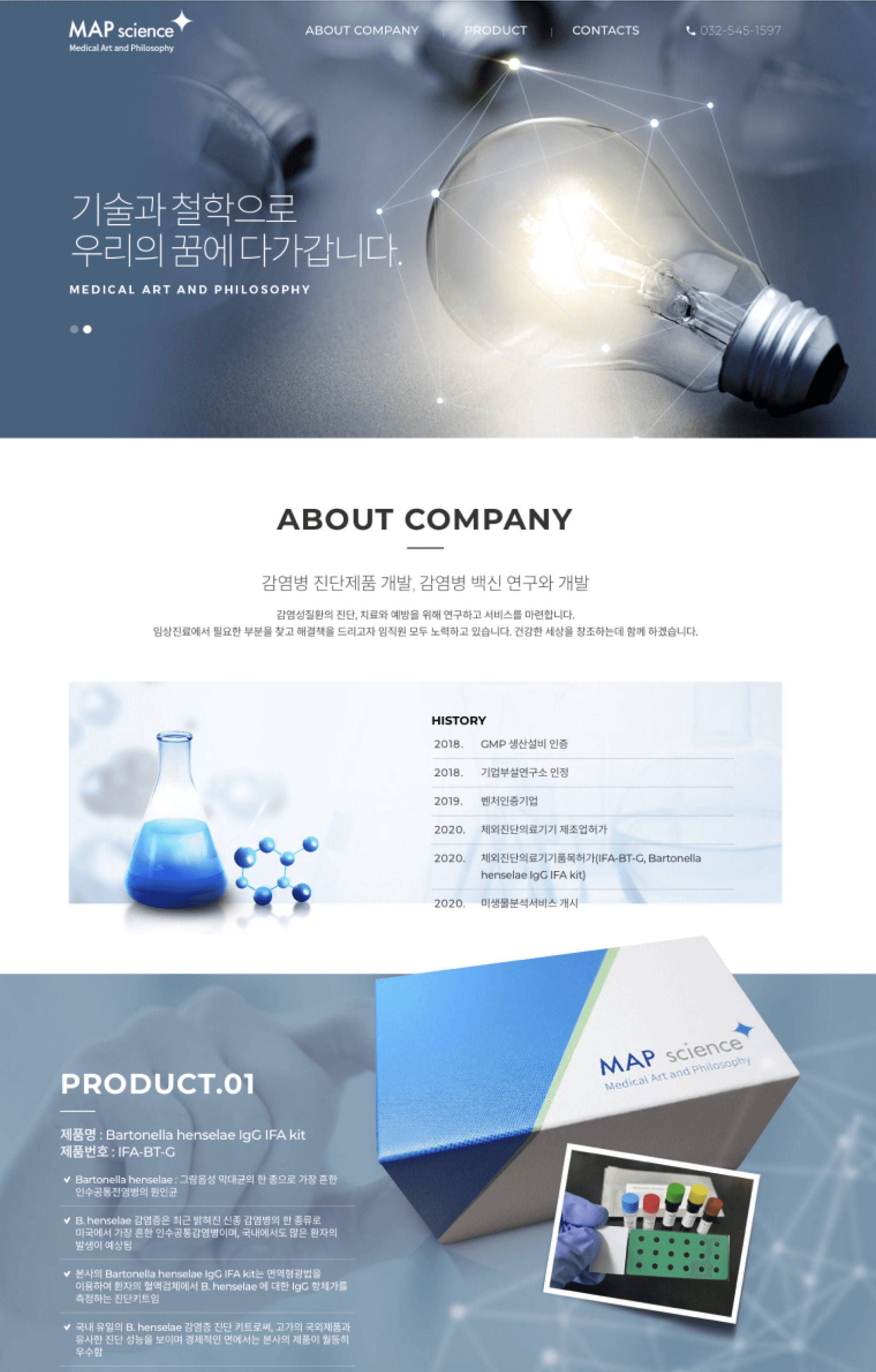

Without “/m” URL
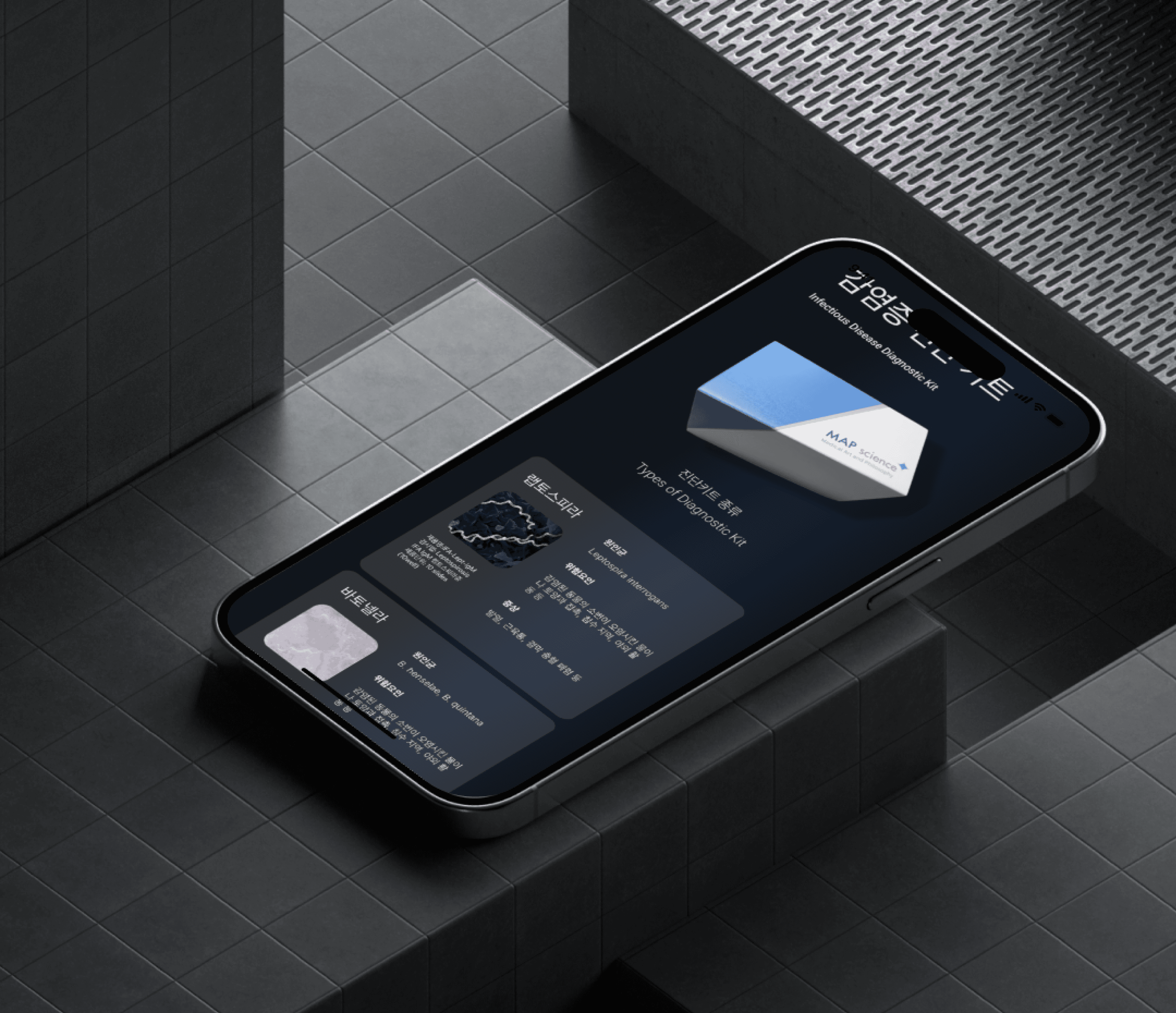
The single-page layout, failed to convey professionalism. Most critically, it had an awkward mobile experience — users had to manually append “/m” to the URL to view it properly on phones.
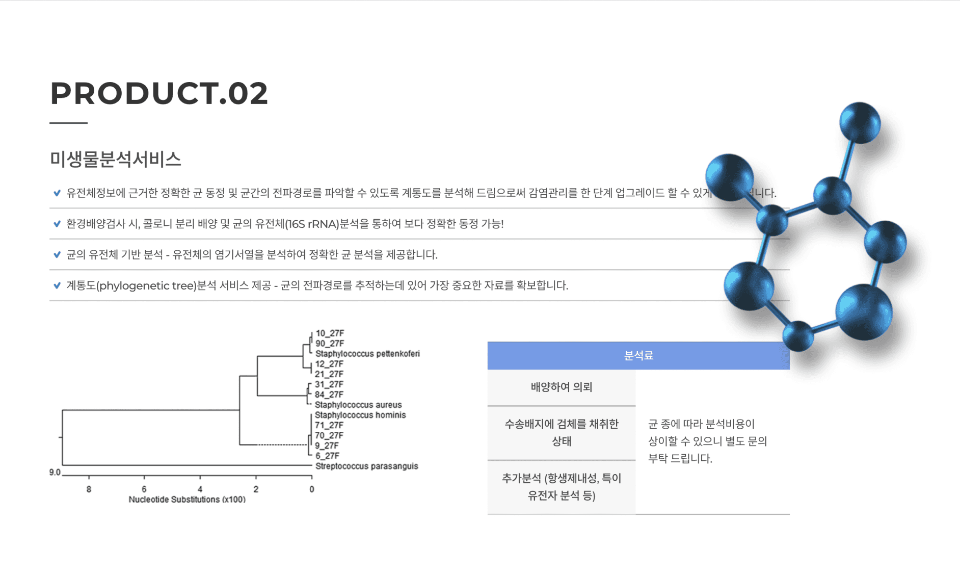
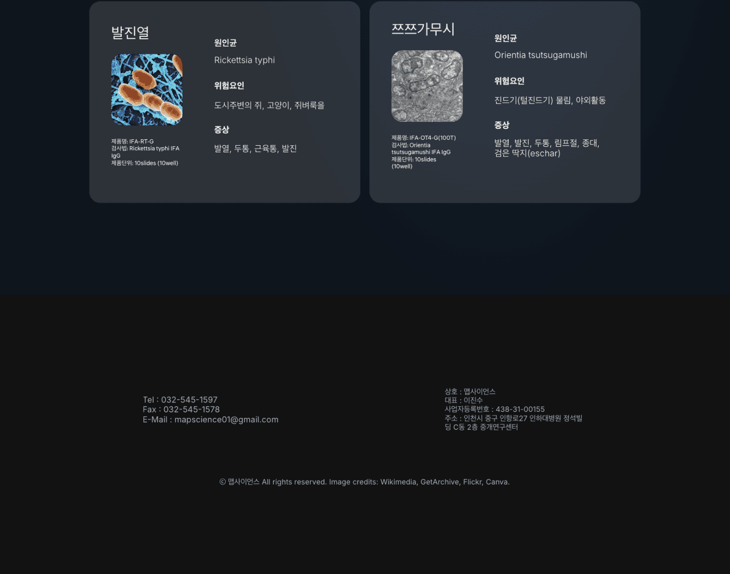

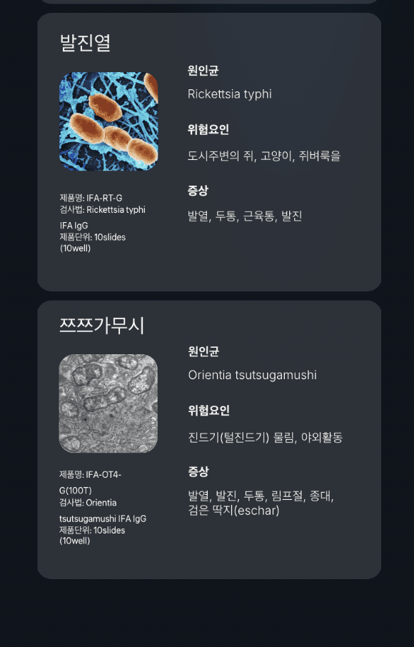
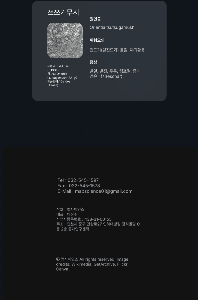
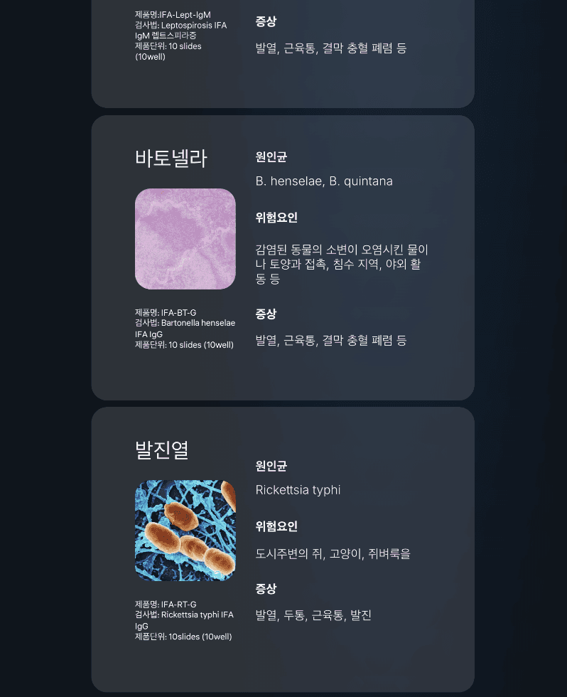
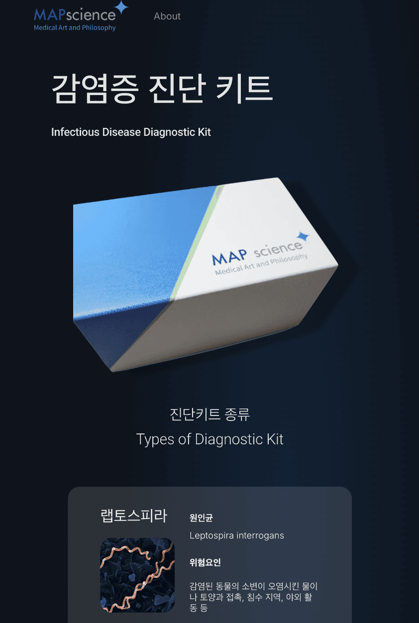
Focus on Product
Removed visual clutter and distraction from the core content through grid and clear box formats, emphasizing the products
Home Page
Expanded Product Categories
Modified Design
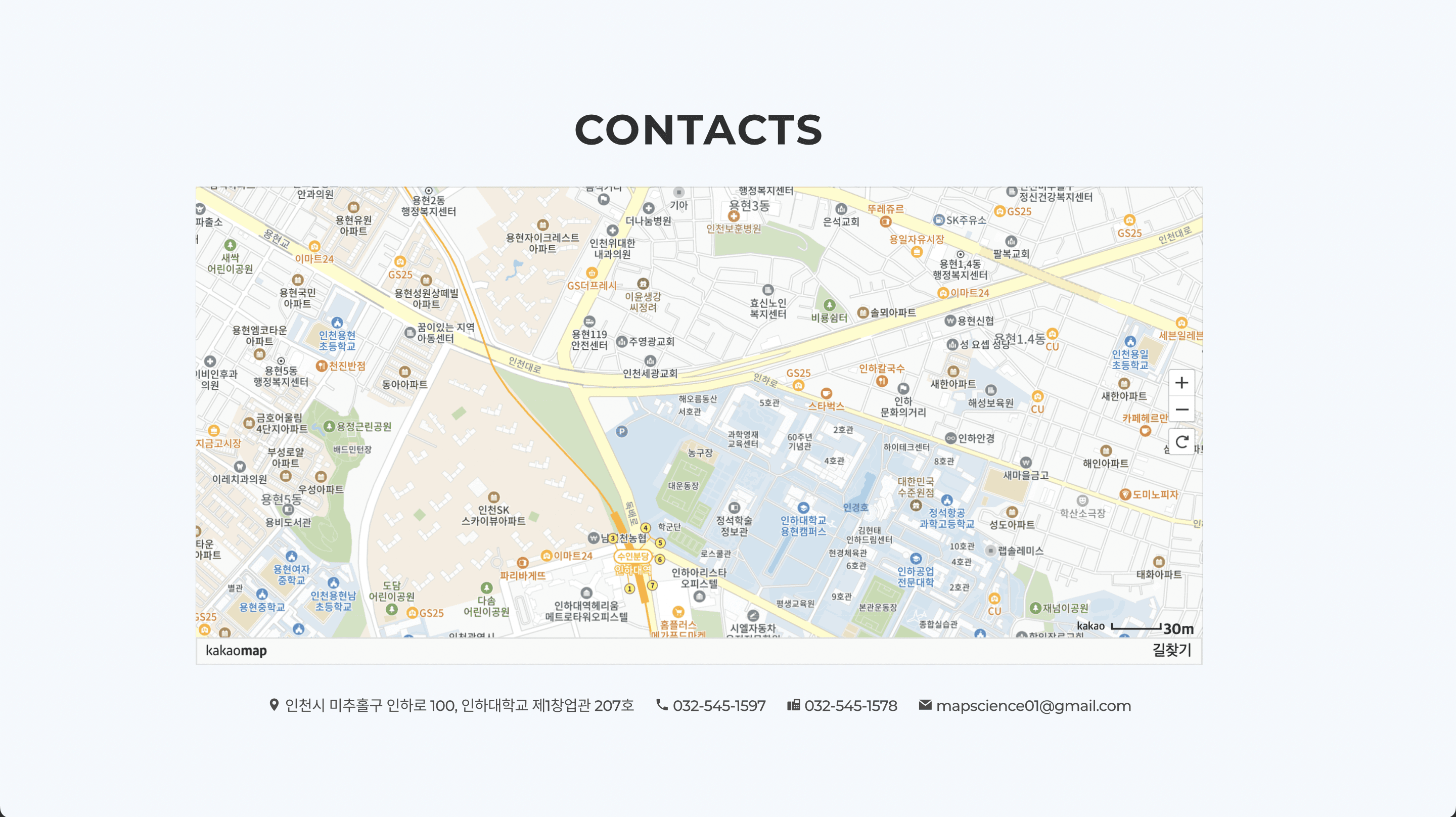
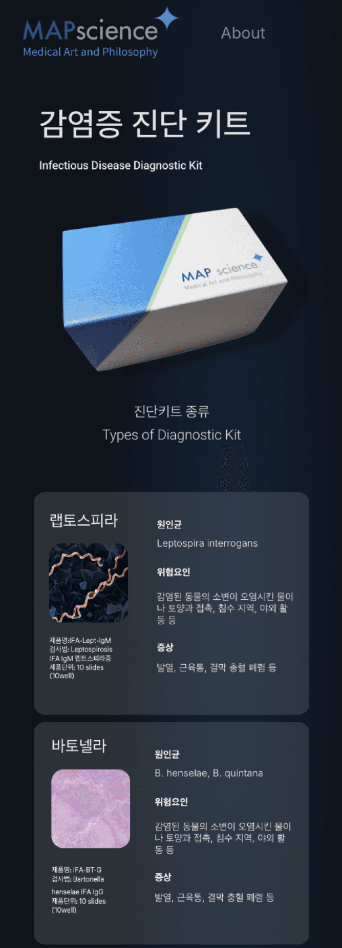
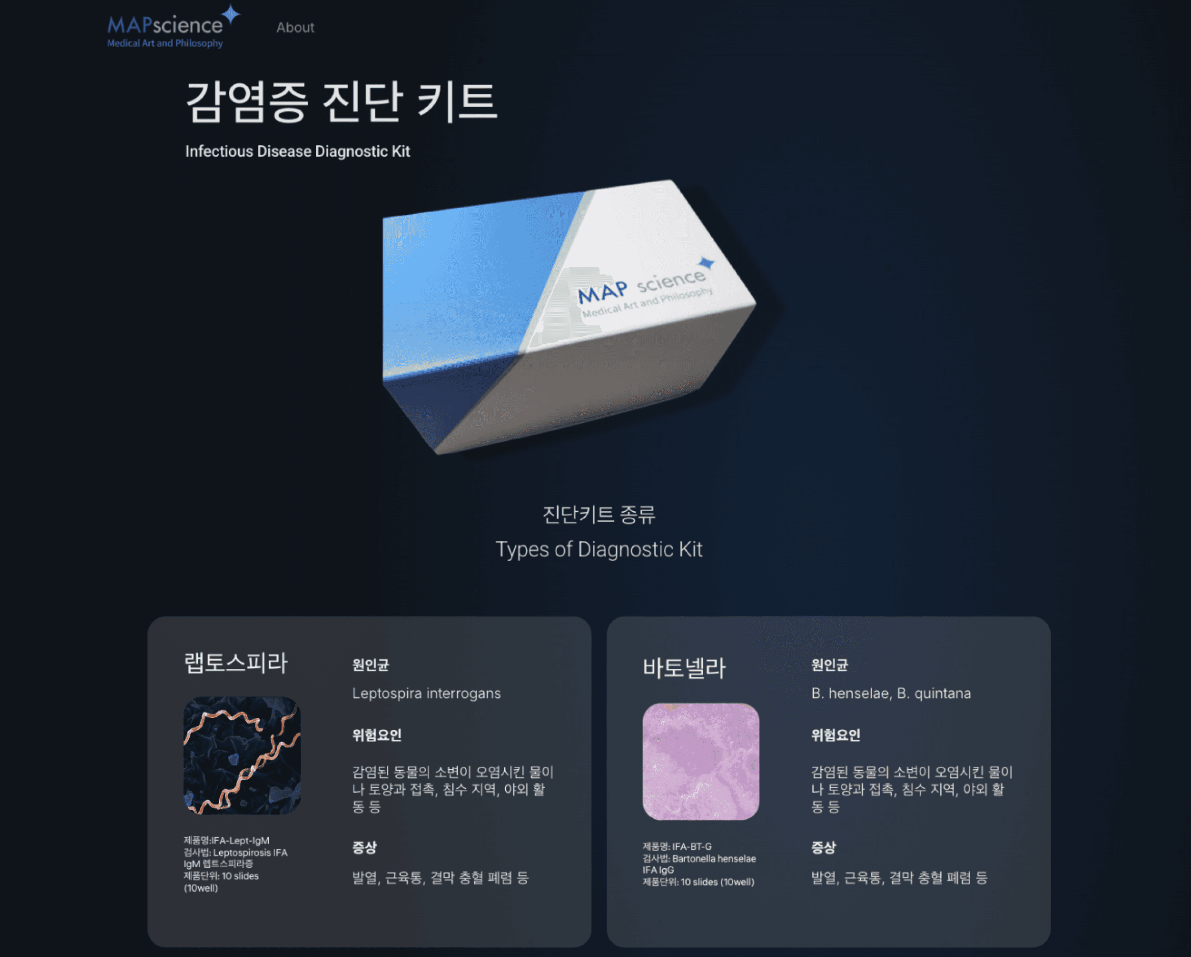
About Page
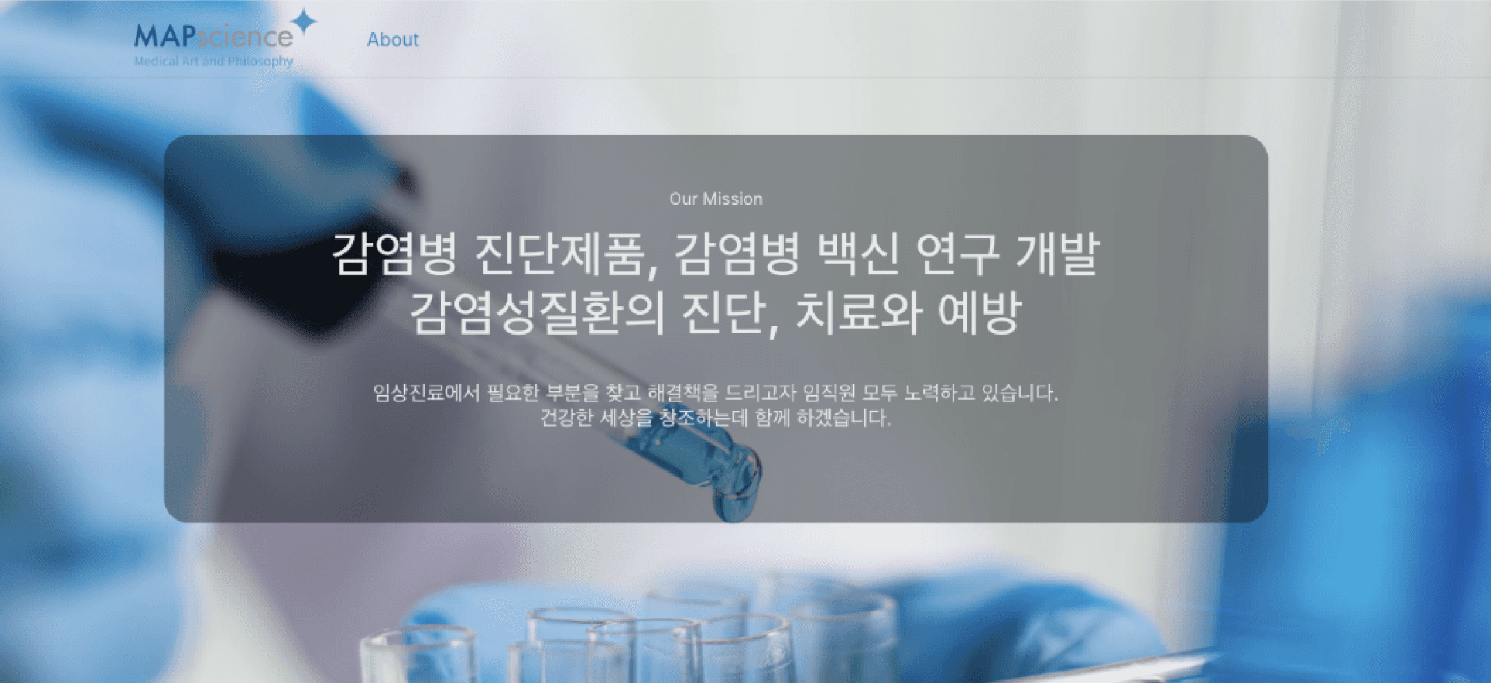
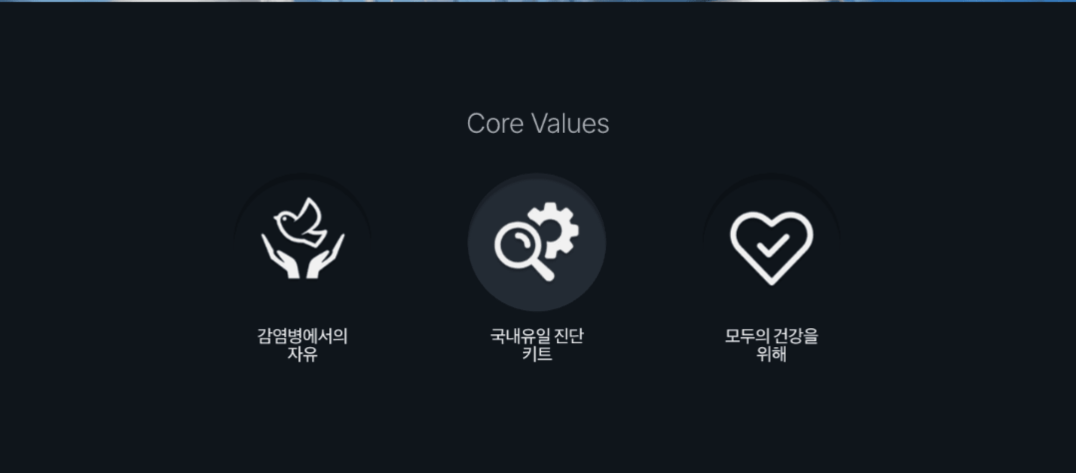
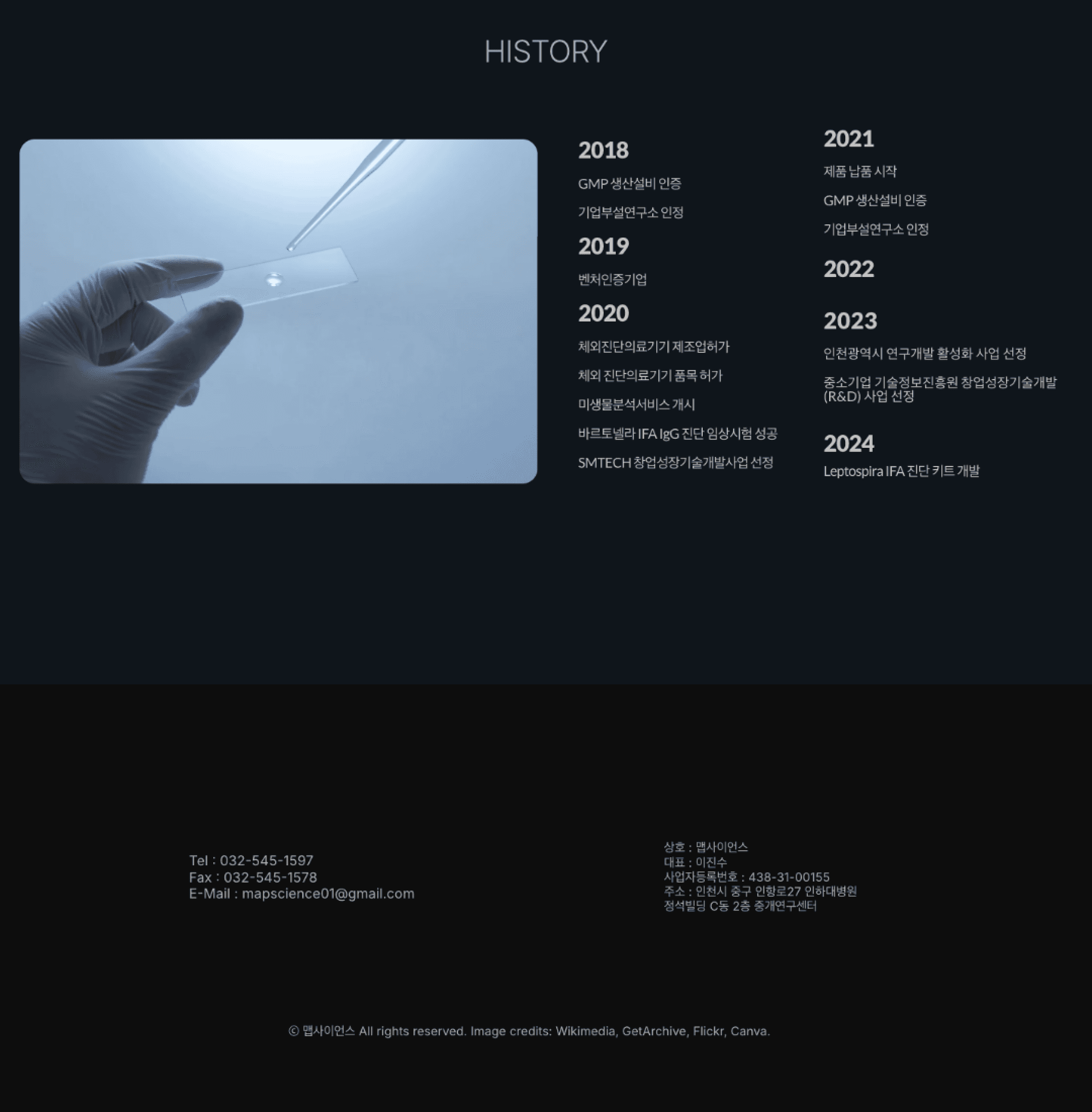
Division of page allowed clarity, credibility and a smoother user experience
Simplified Information into Pages
Noto Sans
Company Logo
Color Scheme
#24233A
#5B84B4
#4C6F8B
#FAFAFA
A B C D E F G H I J K L M N O P Q R S T U V W X Y Z
a b c d e f g h i j k l m n o p q r s t u v w x y z
1 2 3 4 5 6 7 8 9 0
Liter
Fonts (Korean)
Fonts (English)
가 나 다 라 마 바 사 아 자 차 카 타 파 하
가 나 다 라 마 바 사 아 자 차 카 타 파 하
가 나 다 라 마 바 사 아 자 차 카 타 파 하
Responsive Grid System
The flexible grid served as the foundation of my responsive design approach, ensuring a seamless user experience across devices. Using a grid system, I created tailored layouts for desktop, tablet, and mobile to maintain both clarity and consistency
Desktop
1920px / 12 Columns
768px / 4 Columns
Tablet
Mobile
393px / 4 Columns
Reflection
Seeing the redesigned mobile view for the first time without the “/m” — it finally felt like a professional, modern site. Building the entire site to be fully responsive led to a smooth mobile access, making me realize that a small technical fix can dramatically improve usability.
Moreover, I learned the importance of clear communication with the client and the need to approach design from their perspective. By considering their circumstances and priorities, I was able to create solutions that not only reflected my design skills but also aligned with their goals and expectations.
Other Projects


Bona Lee© 2025 All Rights Reserved.
Bona Lee
About