Product Design Internship · 2025
Redesigning a Responsive, Product-First Website


ROLE
Product designer
TIMELINE
June - August
2026
TEAM
Solo Designer
SKILLS
UIUX Design
Map Science, a Korean biomedical diagnostics company, needed a redesigned website to reflect their expanded product lineup and discard their product (microorganism-detecting service).
As the sole designer and implementer, I led the entire process from planning and visual design to building the site in Framer.
Link to website: https://www.mapscience.co/
HIGH-FIDELITY
Creating a seamless experience across every breakpoint
I used responsive breakpoints and flexible sizing to restructure each page for desktop, tablet, and mobile, ensuring content remained readable and consistent at every screen size.


CHALLENGE
An outdated, desktop-first experience that broke down on mobile
The original single-page site felt outdated and wasn’t responsive. Mobile users had to manually add “/m” to the URL, creating unnecessary friction and an inconsistent experience.
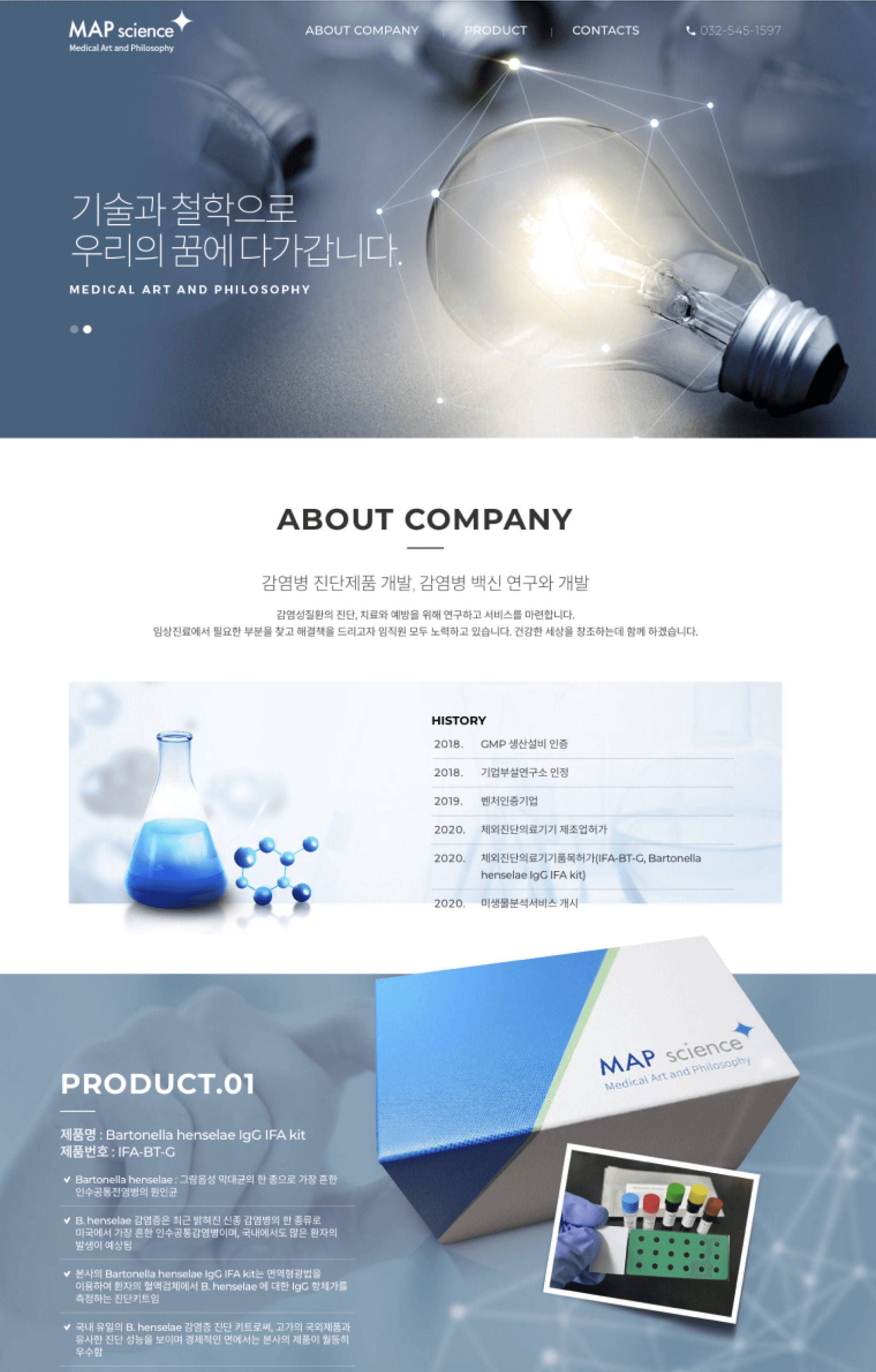
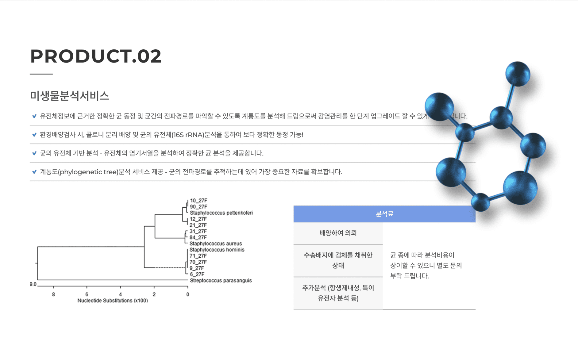
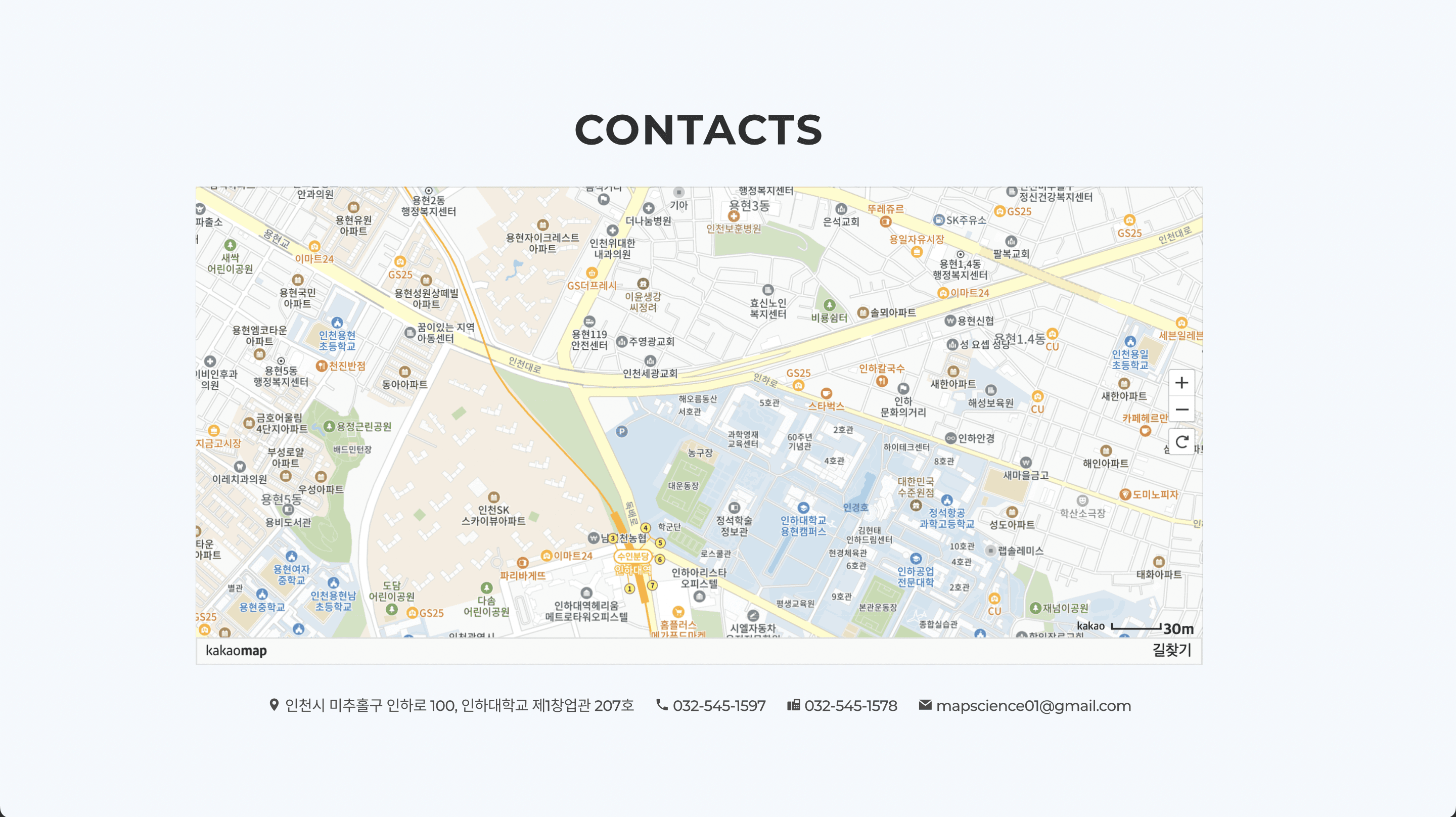
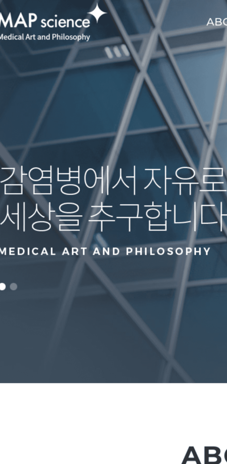
Without “/m” URL
CONTENT STRATEGY
Restructuring product content around the current offering
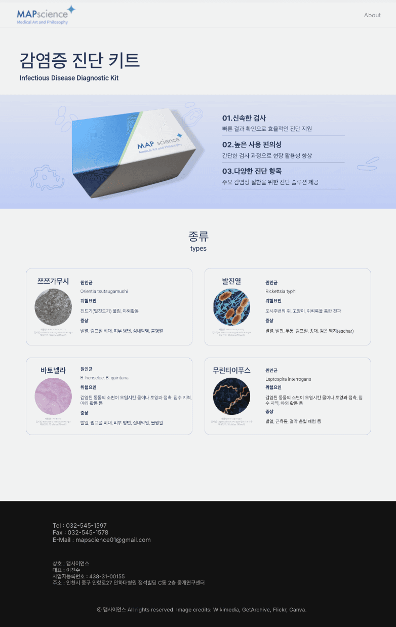
I removed outdated product information and reorganized the remaining content around the expanded diagnostic kit, making its different types easier to understand and compare.
Before
After
REFLECTION
What I learned
Responsiveness is part of the experience, not an afterthought.
Building across multiple breakpoints taught me to treat responsiveness as part of the core experience, rather than a final adjustment. Flexible layouts made the site more consistent and accessible across devices.
DESIGNED AND CODED BY BONA
About